mmcirvin: (Default)
People who know me from way back remember that I'm a big fan of the cantankerous, erudite Polish science-fiction author Stanisław Lem and used to have a website with capsule reviews of all of his work that was, at the time, available in English. A source of frustration for that project was that not all of his work (particularly the early stuff) even existed in English translation, and of the works that did, a couple were only available in translations that were not very good: The Invincible (1964) and one of Lem's best-known novels, Solaris (1961), the book the Tarkovsky and Soderbergh films were based on.

These were both actually translations of translations, rather than direct from the Polish. While some of his works have actually come through all right by that avenue, these two... did not. Solaris was at least tolerable, but The Invincible was a nearly unreadable translation from the German edition by Wendayne Ackerman, translator of the Perry Rhodan pulp series. Over the years people had tried to persuade Michael Kandel, the author of some the very best English Lem translations (such as The Cyberiad, a seemingly untranslatable book), to tackle these, but Kandel had other things to do and the extant translations, however poor, made it a low priority.

In the 2000s, Bill Johnston took it upon himself to translate both of these novels. These editions were only or mostly available as e-books and I never did get around to reading them. But getting a new Kindle finally gave me the motivation to get my hands on them, and I just read The Invincible. Guess what: it's good!

Good, but old-fashioned. This book has a basic structure that appeared in several of Lem's earlier novels and in his late, dark masterpiece Fiasco: intrepid space explorers attempt to probe the mysteries of an unexplored or misunderstood planet, things go badly wrong and they come up against the limits of understanding and human ambition, ultimately discovering as much as or more about themselves as the things they're supposed to be learning. This one was written in 1962 and '63, and the opening has an almost Rocky Jones, Space Ranger feel, describing the titanic and powerful starship Invincible with its crew of manly* spacehands and scientists descending stern-first on the mysterious Regis III. Quaint neologisms are thrown about: the ship's complement includes such things as "energobots" and "infobots"; servomechanisms, atomic piles and magnetic tapes are described in loving detail. This bit might be a little hard for modern readers to get into.

It gets better as everything goes to crap, and the story becomes one of Lem's more atmospherically scary narratives. The Invincible is here to investigate what happened to the previous ship that attempted to explore Regis III, the missing Condor. The planet is a wasteland with no apparent terrestrial life (animal life is abundant in the oceans, but anomalously shy of their attempts at investigation). There are enigmatic ruins that seem artificial but make no sense as buildings. When they do find the Condor, the ship has been trashed and there are signs that the entire crew abruptly lost their minds. It becomes increasingly clear that something terrible happened to the Condor, it's the same thing that happened to all the living things on the planet's continents, and it's going to happen to the Invincible unless they can be smarter about it than everyone else was in the past ten million years.

Not to spoil too much, Lem first explores some themes here that would show up repeatedly in his later books, including Fiasco and the late Ijon Tichy novel Peace on Earth, and in his futurist essays. There's some thoughtful exploration, sophisticated for the time, of how teleological accounts of evolution can be wrong, how notions of human manifest destiny can be equally wrong, and the limits that might exist to people spreading throughout the universe for the sake of it. Its human characters are treated more gently than in Lem's later works--the crew of the Invincible are intelligent folk, not easily driven to mad responses to a situation, and when they do unwise things it's largely motivated by the need not to leave a man behind.

In Johnston's translation, The Invincible is a solid read, provided you make the necessary allowances for its early-1960s provenance. It's perhaps not one of Lem's greatest novels, but it's interesting as an early stage in the development of ideas he'd come back to again and again.


*Like many of Lem's novels, The Invincible takes place in an entirely male universe--I don't think a woman is even mentioned in the story. Stanisław Lem, for his many virtues, was frankly sexist as hell and (as he stated outright in interviews) regarded adding female characters to a story as tantamount to adding a romantic or sexual angle, so unless he wanted to do that, which he usually didn't, he wouldn't bother. Even in his nutty robot fairy tales, the lady robots who showed up were generally treated as prizes or temptresses.
mmcirvin: (Default)
One of the Christmas gifts I just got was a Kindle Oasis, a member of a dying breed of handheld electronic device--the unitasker with a screen. It's just for reading (and buying, oh yes indeed buying) electronic books. It can't do anything your smartphone or tablet can't already do with Amazon's free Kindle app. And, unfortunately, in the way of such things, it's very much joined at the hip to the Kindle e-book store--the point is for Amazon to get even more of your money once you've got it set up. I haven't experimented with how easily it can be subverted to read other types of material, if at all.

Physical design

But since it only really does one thing, it can be physically specialized for that, and it is pretty exquisitely so. It has a touchscreen e-ink display, which is in some ways less capable than a phone screen in that it's slower and entirely monochrome--but it's lovely to look at, high-resolution enough that you don't notice the pixels, and unlike a regular backlit LCD or OLED display, it is reflective in nature and is perfectly readable and crisp even in direct sunlight.

It's cleverly designed to be used one-handed, more comfortably than a phone, except that it's a bit heavier. The device is nearly square, but its screen is the width and almost the height of a mass-market paperback page. The rest, to the left or right side (depending on which way up you're holding it), is a blank bezel area you can grab, with two physical buttons for going forward and back a page (which you can also do with swiping gestures, or by tapping the edges of the screen). The buttons are positioned so that you can operate them with your thumb if you're gripping the device with that hand. The device has an orientation sensor, and the display and the button controls will invert if you reverse it, so you can grip it equally well with your left or right hand. It doesn't rotate sideways--you read only in portrait orientation.

edit: There are a large number of reading options I hadn't discovered when I originally wrote this review, accessed through the "Aa" menu in the toolbar; it is actually possible to set the screen orientation to landscape, but it doesn't happen automatically as a result of rotating the device.

Most of the screen portion of the Oasis is very thin; the rest, undoubtedly containing the battery, is a little thicker, and the resulting ridge in back forms a kind of handgrip if you don't have a cover folded back over it. There's a cloth cover accessory, a little like Apple's iPad Smart Cover, which has a magnetic catch and will power down the device automatically if you close it. The cloth backing makes it easier to hold the device if you do have it folded back. There's also a power button on one end of this battery section, and a Micro-USB port on the other end. I'd have preferred USB-C, but I guess they haven't gotten with the times in this regard.

Light, text and power

The screen does light up, and to be comfortably usable, it pretty much has to light up. While the display is reflective, the "white" pixels are not actually a brilliant paper-white--they're more like a medium gray-tan, so the display looks great without self-illumination in bright daylight (in fact, it might be more readable than white paper under these conditions), but otherwise the reader's internal light is key. Fortunately, it's a really good light that illuminates the screen absolutely evenly with a comfortable brightness; you can adjust it so that it creates a convincing illusion of white paper. Most impressively, it's at least a two-color LED and the color temperature and brightness are independently adjustable. There are clever options to automatically throttle the brightness and make the light warm and yellow in the evening hours, much like modern phones have.

You can vary the font size over a fairly wide range--at largest, the letters are about a centimeter high; I've certainly known people with sufficiently low vision that this would not be adequate, but it will work for most. On the other hand, there are only a couple of sizes you can choose for the text of user-interface elements, which could be an accessibility barrier. You can apparently get it to do some screen-reading things over Bluetooth (see below). Out of the box, most books are readable only in Amazon's default font, a fairly good-looking serif face called Bookerly, but apparently it's possible to add fonts to the device over USB and use them instead.

edit: Again, there are options here I hadn't discovered in the "Aa" menu. You can actually choose any of nine built-in fonts, including sans and serif options and one designed for readers with dyslexia, and you can also vary the boldness, margin size, justification and spacing.

The e-ink display uses less power than a phone display, but Amazon's claim of a battery life of "weeks" is rather exaggerated--I think it assumes you'll be reading infrequently and won't be using the light, and, as stated, you will use it. A full charge on a new Oasis would probably last a couple of days of very heavy binge-reading, like I've been doing. The device, annoyingly, doesn't come with a charger (it does come with a USB-to-Micro cable). You can do some kind of syncing with your computer but I haven't experimented with that.

Sound, networking and software

The Oasis has no internal speaker, but can supposedly pair with a Bluetooth audio device to read text aloud or play Audible audiobooks (but I have not been able to get this to work with the one slightly janky pair of headphones I tried). There is no headphone jack; given the audiobook features I think they probably should have included one, but such is the way of the world now.

It downloads stuff via wi-fi, but I found that I could only get it to connect to the 2.4 GHz channel on our home router, not the 5 GHz. For downloading books, this is perfectly adequate. It's pretty easy to find the MAC address via the settings screens if you need it.

Amusingly, given that this is physically my first Kindle, Amazon identified it as "Matthew's 6th Kindle." I know why this is--I've actually had a lot of devices that ran the Kindle app, if you include not just phones but all the wonky old tablets I worked on a couple of jobs ago, and I think I at least set it up on several of them. Which is not to say they ran it particularly well. But, as I said, any one of them could technically do all the things this reader can.

It's pretty much just a book reader and Kindle store client; there's also a link to the Goodreads review/recommendation service. These functions are as snappy and responsive as they need to be. The device (or maybe just an Amazon account itself) comes with free Kindle access to a collection of dictionaries of a number of major languages, which you can download and then use to look up words while you're reading--this is surprisingly useful. It can also look up words in Wikipedia. There's some kind of "vocabulary builder" app that can quiz you with flashcards about words you looked up in the dictionaries, if you are so inclined.

There actually is a general web browser app, marked "experimental", but it is primitive and painfully sluggish, not good for much. The Oasis really isn't built to do this.

Reading books

This section was going to be at the top, but I didn't want it to be like those recipes that require you to scroll past a multi-page personal reminiscence to get to the ingredients list.

I find that I haven't been reading books a lot over the past couple of years, and I think it's partly that the attraction of "doomscrolling", as people call it now, is too great. There's this inexhaustible supply of outrage, horror and snark generated by the news, and everyone's two cents' worth of opinion on the news, that has great power to distract--and if you're waiting to get sleepy in a dark room, where someone else is also trying to sleep, that can be a terrible temptation that's actually easier to access than a paper book. I don't think it's been good for my mental health, which makes me think I should get back into reading more--reading books rather than the news or somebody's political blog.

Paper books are great, in some ways superior to any electronic device. But having a device that really doesn't do anything but read e-books, and is more convenient than a paper book in some specific contexts, might actually help. Even if it's a bit too closely tied to Amazon.

mmcirvin: (Default)
The Indent-o-Meter was a gag/gimmick I invented in 1993 on Usenet newsgroups that was briefly popular there, but could only exist in a technological milieu that is now so dead that it's hard to even explain what it was. The Jargon File mentions it, but instead of explaining it, it links to an ancient web page of mine that hasn't existed for decades. So of course I'm going to talk about it now. Also because Rowan Hamilton just reminded me of it. If you look at one of my posts from that era in Google Groups, there's a thing at the bottom that looks like this:

--
Matt 01234567 <-- Indent-o-Meter
McIrvin ^ Harnessing tab damage for peaceful ends!

Actually it doesn't look like that, because Google Groups destroys the presentation in various ways that you might understand if you read the rest of this essay. But that's how it looks after being restored by me to its original glory (which was actually a little tricky). What is that? How is it an Indent-o-Meter? What does it do? What was tab damage, anyway?

Tabs and spaces

Every programmer is familiar with the holy wars about using tab characters vs. spaces for whitespace indentation in source-code formatting. Non-programmers may not be. Code-editing tools, to this day, usually use monospaced fonts in which every character has the same width, like on an old typewriter. There will usually be a set of evenly-spaced "tab stops" across the width of the page, and a tab character will mean that whatever follows will be positioned at the next tab stop. It can be useful for formatting code that indicates related blocks with indentation. In the following (which I had difficulty even entering because Dreamwidth's editor won't let me insert tabs with the tab key), there's a single tab character between the numbers and the letters on each line:

1 foo
12 bar
123 baz
123456789 bam

Here, the tab stops are every 8 columns. "bam" gets kicked to the second tab stop because the digits filled up all the space to the first one.

Formatting with tabs can have interesting and sometimes unpredictable results when the code is formatted by different software from the specific environment you wrote it in, which is why some coders don't like them. But that's getting further afield.

Usenet

So to understand the Indent-o-Meter, you have to understand that, but you also have to understand a few things about Usenet.

Usenet was something like an early version of Reddit that worked without a web browser: a store-and-forward network of "newsgroups", discussion fora read with special-purpose software called a newsreader. Early on, most of these ran in plain-text, command-line interfaces, on a computer terminal or terminal program of some sort, and anyone reading them would most likely be using a monospaced font. And most of the time, the terminal had tab stops every 8 characters. So for a while, you could sort of assume that. Some of the time.

.sigs and ASCII art

As with email programs, you could automatically embed a little identifying closing message called a "signature" at the end of your Usenet posts, often by having a file on your account called ".signature", so they were often referred to as ".sigs". In the early days of Usenet it was common for some people to have elaborate signatures with "ASCII art" made out of simple text characters. Sometimes, they'd use a mixture of tabs and spaces for whitespace formatting in these .sigs. So you might see a post whose body looks like

I hate Star Trek: Voyager, it blows!
--
//
STORM // BRINGER
//
\\ //
AMIGA \\ // 4-EVA
\v/


or something along those lines. James "Kibo" Parry had this enormous .sig he would occasionally use that parodied every single cliche used in these things, all jammed together in a cacophony of ASCII that went on for multiple pages. It was a thing to see.

Quoting and indentation

Now the other thing you need to know is that, while Usenet newsgroups did have support for threaded conversations (via links in the headers), and some newsreaders displayed this threading in elaborate ways, it wasn't something you could count on. So, as with email programs, it was common in a response to quote the piece of text that you were responding to, for context. Now, good, civilized newsreader programs didn't put the whole quoted message at the bottom as with barbaric modern email programs. Instead, the quoted text would be at the top, usually indented with an indentation character like ">" at the left. A civilized poster might edit that text down to just what they were interested in responding to. A less civilized poster might not. So an exchange might look like

trekfan72@aol.com wrote:
>I love the fabulous new show "Star Trek: Voyager"! It's the best show ever!

No it isn't. To everlasting hellfire with you!!

and someone might follow up with

cynic@panix.com wrote:
>trekfan72@aol.com wrote:
>>I love the fabulous new show "Star Trek: Voyager"! It's the best show ever!
>
>No it isn't. To everlasting hellfire with you!!

Uh huh yes it is! I hate you!

and so on.

Tab damage

So suppose somebody quoted STORM BRINGER's .sig from up above in one of these replies. It might look like this:

stormbringer@bit.net wrote:

>I hate Star Trek: Voyager, it blows!
>--
> //
> STORM // BRINGER
> //
> \\ //
> AMIGA \\ // 4-EVA
> \v/

NO YOU SPEAK HERESY! I LIKE NEELIX THE BEST

Wait, what happened to STORM BRINGER's awesome Amiga checkmark? Well, they mixed tabs and spaces in idiosyncratic fashion in the .sig text, and the extra indentation on the left pushed some things to the next tab stop, some things one space to the right and some things not at all, depending on how the tabs were used. That is "tab damage".

Harnessing tab damage for peaceful ends

So here's what happens when you quote the Indent-o-Meter and indent it to different degrees:

--
Matt 01234567 <-- Indent-o-Meter
McIrvin ^ Harnessing tab damage for peaceful ends!

>--
>Matt 01234567 <-- Indent-o-Meter
>McIrvin ^ Harnessing tab damage for peaceful ends!

>>--
>>Matt 01234567 <-- Indent-o-Meter
>>McIrvin ^ Harnessing tab damage for peaceful ends!

>>>--
>>>Matt 01234567 <-- Indent-o-Meter
>>>McIrvin ^ Harnessing tab damage for peaceful ends!

>>>>--
>>>>Matt 01234567 <-- Indent-o-Meter
>>>>McIrvin ^ Harnessing tab damage for peaceful ends!

See? The caret points to the number indicating by how many columns the quote has been indented. I did it by inserting a tab character immediately before the column of numbers, and contriving things so that it wouldn't jump to the next tab stop until it had been indented 8 columns. So it's really measuring the indentation modulo 8. Some versions noted that fact in the text. I changed up the text a little, proclaiming that someday tabs would be too cheap to meter, or that someday tab damage would light our homes, etc. There was usually some note of crazed Atomic Age futurism in there.

Sic transit gloria mundi

So Google Groups ruins these in a couple of ways: it renders all the posts in a proportional font, AND it reformats the whitespace so the tab characters don't work right. So it completely breaks the Indent-o-Meter if you look at my archived posts from the era, or at the posts of anyone else who filched the Indent-o-Meter (and there were surprisingly many of them for a year or two).

In fact, people started reading Usenet through means that used proportional fonts and I knew even at the time that the Indent-o-Meter's time had passed. For a while I tried replacing it with the Font-o-Meter, which did not use tabs, but attempted to exploit the different relation between character widths and spaces in monospaced and proportional fonts:


Your font is: Proportional Monospaced
^
The amazing Font-o-Meter! http://world.std.com/~mmcirvin/


Your font is: Proportional Monospaced
                             ^
The amazing Font-o-Meter! http://world.std.com/~mmcirvin/

It worked all right but was not nearly as much of a hit.
mmcirvin: (Default)
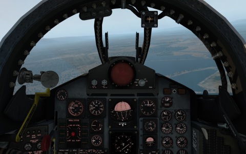
Well, I sprung for XPlane. MSFS2020 won't run on my Mac, though it might be interesting to check out the XBox version when it appears. But XPlane 11 does. It's a lot of fun, though I think anyone getting into it needs to realize what it is and isn't.

F-4 Phantom cockpit control panel

This is pretty much the opposite of the Google Earth flight sim. Which is to say, it treats the world scenery with some indifference, but this is the one for people who are really, really, really into the planes.

Detailed view of the interior of a 747 cockpit

The cockpits are all modeled lovingly in three dimensions, and you can move about the cockpit and examine all the switches and gauges in detail; many of the doodads in there will actually be operative. By default the sim starts you on the runway with a full tank and the engine already running, but if you want, you can run through all the checklists and bring up a jetliner from completely powered-down (there's a version of this sim, not the standard retail version, that is certified for pilot simulator training--the key thing is apparently that it has to make sure it's always running at maximum FPS). You've got a mix of general-aviation aircraft, jetliners and fighter planes, an incredibly fun ultralight, a helicopter (haven't tried that yet), some exotic things like an X-15 and a Space Shuttle orbiter. For the latter things, there's support for planes carrying other planes (you can be the carrier, or be carried and have an AI take you up).

Crashed X-15 with smoke coming out

One problem if you're just using a single laptop monitor is that some of these control panels are physically gigantic, particularly in the big airliners, and in something like a 747 it can be hard to even look at the standard gauges while also keeping an eye out the window. You spend a lot of time panning around inside the cockpit with the view controls. The more modern planes have glass cockpits and you end up trying to interpret a little screen on your big screen. There's a HUD mode available with all planes (whether it would make realistic sense or not) that alleviates these issues, but I think one of my favorite planes in the program is the Stinson L5 Sentinel, a World War II-era military light plane, just because it's got a compact basic instrument cluster that is really easy to look at. People who are really into this stuff have elaborate multi-monitor setups that wrap around them almost like a professional simulator cockpit, sometimes with subsidiary computers just to control additional displays; XPlane supports a boggling variety of options, including VR headsets and using tablets to display control panels. I might try connecting an external monitor and using the main one just to display instruments.

Pilots seem to really like the flight model here; according to them, at least, the planes handle realistically. I wouldn't know, but the handling differences between the aircraft are palpable. I tried plugging in an XBox controller, and XPlane calibrates and handles it flawlessly*; a more serious user will doubtless prefer a realistic flight stick or yoke, but of what I've got, this is clearly the best way to control the simulation. The twin sticks give you independent rudder and aileron controls so you can practice coordinated flight; some buttons map to the throttle by default. When you have to push on the stick like a pilot would, instead of effectively controlling a virtual yoke with a keyboard or mouse, it does give you an appreciation of what trim controls are for.

747 Carrier Aircraft on runway with Space Shuttle orbiter on top; tiny caption says 'Space bar to separate'

What it's not is a sim for sightseeing of famous landmarks in the virtual world. It doesn't stream scenery like Google or Microsoft do, so the whole world has to be stored on disk, and the main way to scale back detail for lower-powered machines is to reduce the number of generated buildings. The scenery generally looks OK, but in a generic way. Cities will have more or less the correct street layouts, but be populated somewhat haphazardly; if you've got the scenery complexity set to low (which I think is the default), many towns will have streets but almost no buildings, and the world ends up with a barren, post-apocalyptic quality, almost Fallout 4-like. It looks better if you dial up the graphics settings (at risk of getting nagged that your system is too feeble to hit 60fps--at least you can turn off the nagging). But you'll still get a weird alternate-universe feeling if you try to go somewhere familiar to you, because almost everything is a generic object.

On the other hand, it's got a gigantic number of airports, basically every airport of significance in the world. Those are quite detailed--but with an eye to functional aspects a pilot would care about, not striking terminal architecture. Toodle around a major airport (the ultralight is useful for being a fly on the wall) and you'll see planes with all sorts of airline liveries, moving airport vehicles, etc. You can communicate with the tower, request and receive clearance if you want to play that way, get refueled and even pushed back from the gate by a tractor. (small correction: you can summon the snack truck and the pushback tractor, but not the fuel truck--you "refuel" just by editing your vehicle settings: in real life that takes a long time anyway.) All the navigation and ILS equipment is of course operative (even 1980s Flight Simulator had a lot of that). The night lighting of runways and taxiways is spectacular. But you won't find IAD's swooshing Saarinen terminal or LAX's Theme Building rendered recognizably. If you mostly want that, you might as well stick to Google Earth. Where this game gives near-pornographic aesthetic attention is the aircraft.

My impression is that MSFS 2020 is an attempt to bridge these worlds--it's got the accurately rendered planes in a mind-blowing streamed world. But even there, you may need fairly grunty hardware to get all the benefits.

* I also got around to trying the XBox controller with the Google flight sim, and it tried to handle the thing but there were hopeless calibration/centering problems that there seemed to be no way to address. Will need to stick to the mouse with that one.

mmcirvin: (Default)
Continuing my series on flight-sim and related software...

When I was young, the one thing a video game could consistently do to impress me was to show some kind of first-person perspective view (like about 2/3 of the high-end console and PC games that exist today). This wasn't so common back then. The level of technology at the time made it fairly difficult to do, and even if the game wasn't very good, I'd think it was cool. Many of the arcade games that tried it early on, like Battlezone and Star Wars, are rightly considered classics.

Many of the first games that attempted to try it were "space pilot" shoot-em-up games that put you in the cockpit of some kind of science-fiction starfighter, shooting at enemy spaceships. Space could actually make the presentation a little easier, because you just needed a black screen with some kind of stars or small objects streaming at you in perspective. There was no need to render a whole landscape.

Here, though, is a game that attempted a first-person flight-simulator-like view on an Atari 2600, with a moving and tilting horizon. It's Air Raiders, a 1982 "M Network" game from Mattel (highretrogamelord's video):


Air Raiders is a bit unusual for Mattel in that it's an original 2600 release instead of a port of an Intellivision game, which all their other "M Network" offerings were. If you want to play it, it's actually available in volume 3 of the Atari Flashback Classics collections on consoles. (I said a while ago that those collections only had games that lacked any third-party licenses--that's not strictly true: they've also got some M Network games.)

The game is OK, not great. It gets a bit repetitive, like many 2600 games do if you play them for more than a couple of minutes. But that flight-sim-like view is really cool. I was wondering how the heck they did that on the Atari 2600.

The 2600, famously, was really designed for games more like the early Video Olympics (Pong Sports) and Combat cartridges, and has no frame buffer representing its display screen in RAM; it doesn't have enough RAM for that. Its TIA video chip has just got a few registers whose bits represent the pixels, positions and colors of various objects on the current scanline. There are:
  • two "players" (8 bits across with widths and colors you can set independently),
  • associated "missiles" (just a pixel of adjustable width, colored like the associated player),
  • the "ball" (another, independently colored pixel),
  • and the "playfield" (two and a half bytes representing 20 chunky pixels, either reflected symmetrically or repeated twice across the scanline).
You'd generally have some code that ran during the horizontal blank between scanlines, that copied some bits of the game ROM to these registers and set object positions and colors. By swapping out the ROM bits, you'd build up shapes on the screen. You could play a lot of tricks by just changing the colors between scanlines, and if you were really advanced, you could swap stuff around partway through the scanline; that was how games like Space Invaders displayed more moving objects (though you had to be careful about the time it took code to run). All this was famously called "racing the beam".

Notice that the horizon here only has three possible tilt positions: you can bank to the left at a fixed angle, bank to the right at a fixed angle, or fly straight. That is undoubtedly a helpful simplification. But it can move up and down in any of those fixed positions, and there's a grey runway that appears sometimes as well. I figured these things, as well as the peculiar cockpit arch over the top, were somehow displayed using the playfield object. But how? The horizon is neither symmetrical nor repeated.

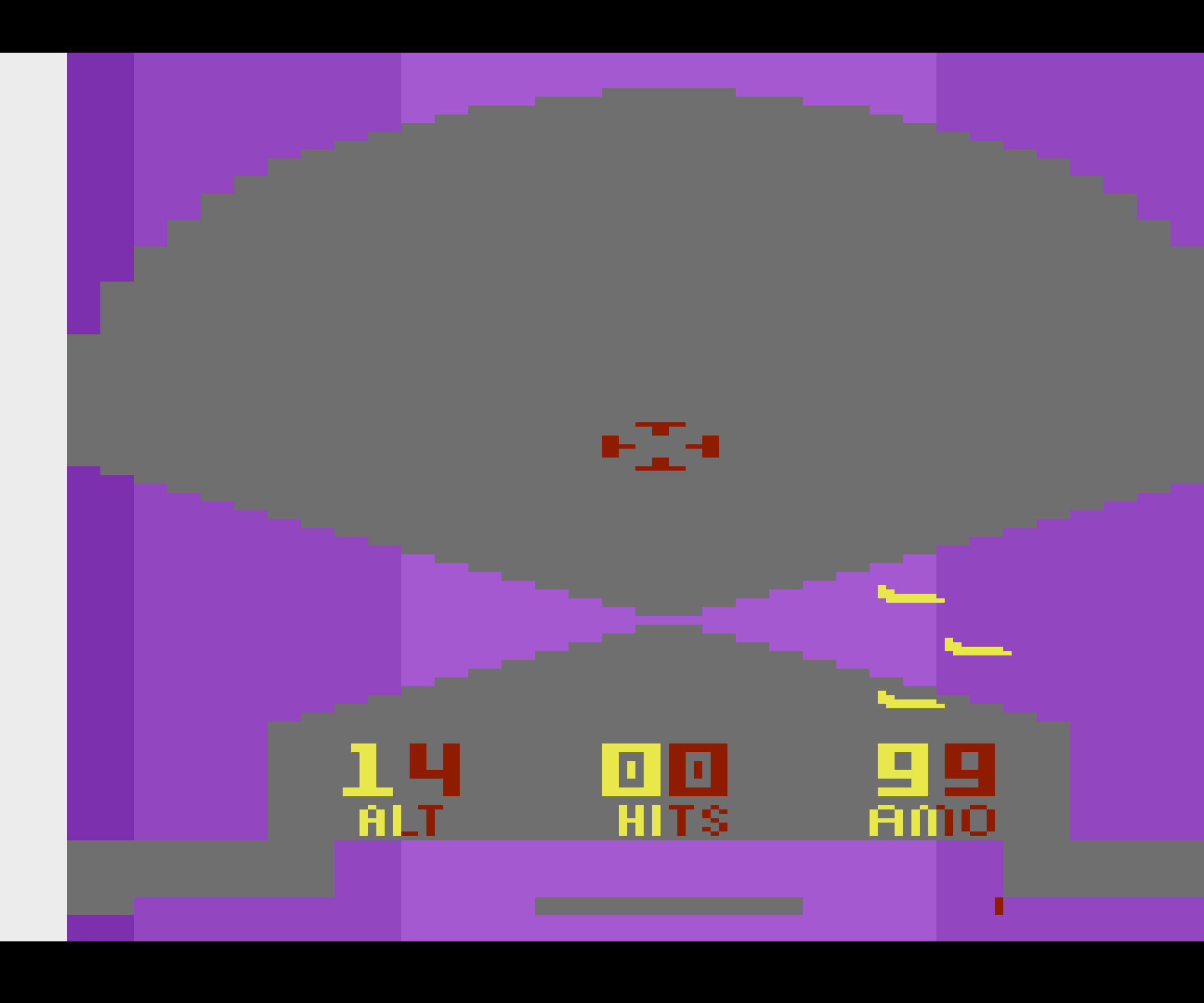
The Stella emulator has a debug mode that swaps out fixed colors for the TIA's color registers. That can actually show you which objects are being used to represent things on screen. When you apply it to Air Raiders, the result is THIS:

A low-resolution video screen with an arch across the top in shades of purple, and a sort of X in the middle formed by two triangles in shades of purple reaching in from the left and right. There are also a crosshair, three enemy planes and a score/stats display in yellow and dark red.

What sorcery is this?
The purple areas represent the playfield object (shades of purple represent which bytes are being read). Yellow and red are the player objects, and gray is the raw background. Air Raiders can move that peculiar "X" made out of playfield triangles up and down by just shifting the values that it writes into the playfield registers at various times.

I think the rest is all done by playing with the color registers. Air Raiders must have some code to swap out the colors at the center of a scanline, right where the middle of the X is. Suppose you're banking to the left, so it wants to render a tilted horizon from upper left to lower right. Above the center of the X, on the left side of the screen, it colors the playfield green and the background sky blue. On the right side of the screen, it swaps the color registers so that both are blue.

Then below the center of the X, it does the reflected complement of that: on the left side, both playfield and background are green, and on the right side, the playfield is sky-blue and the background is green. The net effect is a tilted green horizon against blue sky.

If the horizon needs to be tilted the other way, the color-swapping trick is just done in the mirror reverse of this. If it's not tilted at all, that's much easier--all you have to do is change both color registers from blue to green partway down the screen. And the grey "runway" that appears sometimes is just displayed using these same objects, by leaving the playfield green but turning the background pixels gray near the bottom of the display!

Absolutely brilliant. To make a good-looking game on the 2600 you had to be very clever.
mmcirvin: (Default)
I've been interested in the generally positive reaction to the new Microsoft Flight Simulator, though I don't actually own a computer that can run it--I'd probably have to bogart my daughter's souped-up Windows rig. Apparently some kind of XBox version is coming, though I can only imagine it'd be very stripped-down.

But the YouTube reactions to it are interesting: a lot of people just seem wowed by the idea of a flight simulator that can stream a whole world's worth of scenery over the net, in Google Maps fashion (it's actually based on Bing Maps, with a heavy overlay of procedural-generation trickery to fill in gaps in coverage).

The funny thing is that a much simpler version of that has existed for 13 years, for free!

You may have forgotten about it, but Google Earth used to be a standalone app (acquired from an outside company called Keyhole), and that actually still exists. It's called Google Earth Pro, but despite what that might seem to imply, it's a free download. The app seems kind of janky and archaic these days, but it uses the same data as Google Maps. And it has a flight-simulator mode, added in 2007. Originally, it was an Easter egg only accessible through a key combo (command-option-A on the Mac), but now there's a menu item for it.

No pilot or serious "simmer" (like the person who made the video below) would take it as more than a silly toy. There's no cockpit panel, just a simple HUD inspired by fighter planes; it seems to lack such luxuries as brakes of any kind or the ability to steer the plane on the ground (there must be some way to do the latter because they do it in the video, but I can't figure out how), your fuel tank is infinite, and it happily lets you taxi on water and fly through buildings. Sometimes you clip through the landscape and get a peculiar sliced-up view of the underside of the ground. You have two planes, a Cirrus SR22 or an F-16.

(edit: Shift + arrow keys seem to be the rudder pedals. There may not be any auto-coordination. Don't know if there's a way to control them with the mouse. I also found an ancient Google Earth Blog post that explains that comma and period are the left and right wheel brakes, which you can use to control or stop your motion on the ground--the documentation the app actually links to won't tell you that at all. They recommend using the brakes to steer, I guess because it's easier than explaining to their readers how to deal with the rudder.)


But on the basic "I can see my house from here" level, it's a terrific toy. I hadn't played with it much until recently, inspired by the hype for FS2020. I really like buzzing around my town and environs--it makes me realize that eastern Massachusetts is really kind of a lovely place, seen with fresh eyes. I'd always wondered what it would be like to take off from the little general-aviation airport down the street from here, and you can (in the SR22, at least).

Looking at Google's 3D scenery with the usual Maps interface, it feels like you're interacting with a very detailed miniature, like a model-train setup. Somehow, looking at the same scenery at the same level of detail with the flight sim gives you a much more visceral feel of moving through a full-sized world. It's fun to zoom around at Mach 2 in the F-16 at treetop level, presumably destroying the eardrums of anyone in the vicinity (the game itself is silent), though that will usually over-fly the streaming of the scenery so you only see low-resolution versions of the stuff; the slower plane is better for sightseeing.

You can take off from any level place you can click on in the map, but there are a bunch of presets. One of them, doubtless put there for old flight-sim fans, is Meigs Field in Chicago, the original starting location for Microsoft Flight Simulator and Flight Simulator II. But Meigs was abruptly ripped out years ago and the area converted to a park and sculpture garden. So the program will just let you take off right through the sculpture garden, which is surreal.
mmcirvin: (Default)
Microsoft recently came out with a brand-new, apparently well-liked version of its venerable Flight Simulator, for our Windows PC-using friends. LGR celebrated by reviewing Flight Simulator 4.0, from 1989:


The version of Flight Simulator I first encountered was probably Microsoft Flight Simulator 1.0 on the little green monochrome screen of my dad's Compaq. Marco here is playing a slightly later version, I think, but the monochrome display takes me back. Anyone who played Flight Simulator in this era will remember starting out at (the now-defunct) Meigs Airport on the lake in Chicago:


Flight Simulator was the creation of the immortal Bruce Artwick, who I mentioned earlier as the author of Night Mission Pinball. The first version was apparently a relatively primitive, but revolutionary, program for the Apple II, sold through his company, Sublogic; its enduring legacy was the World War I dogfight mini-game that was retained in most of the early versions of the program. The strange gridded landscape bordered by billboard-like, two-dimensional mountains from that mode was Flight Simulator 1's entire world. Microsoft had Artwick develop the much more sophisticated Microsoft Flight Simulator to show off the capabilities of MS-DOS PCs, then its features got back-ported to other platforms and sold by Sublogic as "Flight Simulator II".

I eventually bought this version of Flight Simulator II for myself. It came out around 1986 for the Atari ST, and this is the one I have the most nostalgic memories about:


FSII for the Atari ST was more sophisticated than Microsoft Flight Simulator 2.x; this was the version that introduced mouse control, a custom windowed interface, and the ability to get a third-person view of your plane, and for the first time you had a choice of planes in the main simulation mode: a Cessna 182 or a Learjet. It shipped with a San Francisco Bay Area scenery pack that was much more detailed than the ones that came with previous versions, and the default airport switched from Chicago Meigs to Oakland International, to show it off. Eventually, these features found their way into Microsoft Flight Simulator 3.0.

I spent countless hours in college just noodling around with this thing, flying around exploring its little world with no particular goal in mind. Flight Simulator has always been like that--while you can certainly set piloting challenges for yourself, and just landing the plane at an airport is a challenge in itself, aside from the World War I mode it has no scoring or narrative. It's quite educational about aviation if you choose to take it that way, and it shipped with a huge amount of paper documentation, but I suspect for most users it was always just a way to goof off and relax, with enough serious "simulation" trappings that you could tell yourself you weren't doing something completely aimless.

This 1986 ST version plays remarkably well under the Hatari emulator, though it probably plays better if you're using a real mouse and a keyboard with a numeric keypad, since it's very much built for those. Hatari can also emulate a 32 MHz Atari TT, which plays this game at a pretty sweet frame rate--Flight Simulator was intelligent enough that for the most part it didn't rely on the processor clock for timing, so it adapts smoothly.

Playing it now, one thing that does strike me is how little the game does to hold your hand when it comes to navigating its world. There are a few preset situations on the game disk, but they actually don't cover all of the scenery areas that the game ships with (SF Bay Area, LA, Chicago, NY/Boston and Seattle). Out of the box, there's no way to just say "start me at Boston Logan".

There's a "slew mode" that lets you suspend physics and just move the plane freely about the world, but the easiest way to jump from one populated scenery area to another is to type in coordinates, and the coordinates are not latitude/longitude but Flight Simulator's own idiosyncratic system. So you pretty much had to rely on the paper charts that shipped with the game, which gave positions in these coordinates (I suppose that was an extra layer of copy protection). And even so, the coordinates could be imprecise enough that it could be difficult to position the plane at a runway without dropping it from a height and immediately crashing it.

These quirks were things people just lived with, because nothing was quite like Flight Simulator back in those days.
mmcirvin: (Default)
Once we were shut in I decided to revive my old bread-machine oatmeal-bread recipe, only to discover that (1) my bread machine was dead, and (2) my yeast was all dead. It can survive in the freezer for a long time, but evidently not most of a decade.

Instead of trying to repair the 20-year-old machine, I threw it out, and decided to get into doing it by hand. We managed to get this comically huge industrial-sized double package of Fleischmann's instant yeast from BJ's, so we have effectively infinite yeast at this point. Bread flour is hard to get, but I got some all-purpose and some whole-wheat flour. I don't have a bread pan so I'm making peasant loaves on a cookie sheet for now.

Instead of posting whatever recipe I used last, I'll be more useful and say that the recipes I'm converging on are all variants of this simple one:

The basic recipe

4 cups some kind of flour, plus more as needed (see below)
1/2 tsp instant yeast
2 tsp salt
2 tsp some kind of sugar
2 cups warm water

Mix all dry ingredients in a bowl. Add the warm water and knead it for about 10-15 minutes. Initially the mixture will probably stick more to your hands than to itself. Add small amounts of extra flour (a tablespoon or so at a time) and keep kneading until it doesn't. Eventually it will be an elastic dough ball with a nice doughy texture.

Cover that in the bowl and let it rise for a couple of hours or so. With basic white bread you'll see it double in size. Punch it down if you like, put it on the cookie sheet, shape it into a loaf, put some artistic slashes in the top and let it rise, I don't know, 30-60 minutes.

Preheat the oven to 450F. Bake the bread at 450F for 15 minutes, then lower the temperature to 375F and bake for 20-25 minutes, until the crust looks nice and browned. Take it out, let it cool for 15-30 minutes, then serve.

Yeast

I'm using instant yeast, which is the identical stuff also called "quick-rise yeast" or "bread machine yeast", because it's what I got. This stuff is convenient because you can just mix it with the dry ingredients and it will work.

You can likely use other kinds of yeast identically in the above recipe, except you can't just mix it in dry, you have to do the "proofing" thing that you can look up somewhere else, where you put it in water with something to feed it and make it bubble. I don't have experience with that.

You can shorten the rise time by bombing the mixture with far more yeast, but you get this obvious yeasty flavor that you've probably tasted in bread-machine recipes (you can see that I used way more in my old recipe). There's a point of diminishing returns for that.

You can use less yeast and wait longer, and it might do good things to the flavor--today I tried 1/4 tsp and a four-hour rise, but I'm not sure it made a big difference. I haven't tried retarding the rise in the fridge overnight, or any tricks like that (experiments will probably happen in the future).

Ingredient variations

This recipe works fine with all-purpose white flour to make a basic white bread--you don't need bread flour. You can substitute in wheat flour for at least one cup of the white and it works basically the same.

Today I tried adding about a quarter cup of oatmeal to the mix as well. That, or substituting in a lot of whole-wheat flour or other whole grains, is going to make the loaf rise less, I think because the bran breaks up the formation of gluten
 (everything I know about this comes from Harold McGee's On Food and Cooking). So the oatmeal bread will be a denser loaf; you might try waiting for it to rise longer, but in my experience with the oatmeal bread, even with my old bread machine, a lot of the rise you get is actually going to happen at the beginning of baking. With white bread, it gets more of its rising done before that and is fluffier.

The salt actually strengthens the gluten network, something I didn't realize until recently. According to McGee, this is because the ions neutralize electrically charged regions on the gluten protein that would otherwise make adjoining molecules repel each other. I'm not using a huge amount of salt, but putting in some does help the bread to rise and retain its shape.

You can use brown sugar in place of white; I usually do that--I think it tastes better but it doesn't make a huge difference. I'm using much, much less sugar than I used to with the bread machine. I suspect you don't actually need any in this recipe, but I haven't tried leaving it out entirely.

Adding other stuff

My old oatmeal-bread recipe was more complicated and involved milk and oil. I'm not sure any of that was doing anything good aside from affecting the flavor a bit. Putting in oil tends to have a similar effect to adding oatmeal, in that it weakens the gluten and therefore makes the dough rise less. It might increase the shelf life a bit and give it a moister texture. But I'm leaving it out now.

I
 actually have some wheat gluten that I bought ages ago. Adding a bit to the mixture can help with the oatmeal variant. Bread flour is just white flour with more gluten than all-purpose.
mmcirvin: (Default)
So when I posted on Facebook about the peculiar phenomenon of the Thue-Morse sequence making snowflake curves, Owen immediately asked the logical question: what about those fancier sequences associated with his recursively nested three-legged or n-legged multifractions? The n-ary Thue-Morse sequences, as I'm calling them? What do they do when you let the same turtle algorithms loose on them?

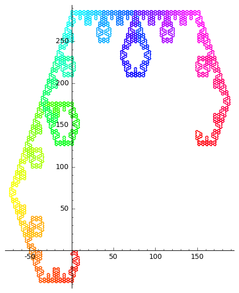
Well, I tried it and immediately got these nice things. This is the ternary Thue-Morse sequence interpreted with a 1 as "move forward and turn left 60 degrees", anything else as "move forward and turn right 60 degrees":

Fractal with a vertically-stretched, hexagonal appearance, with axes showing that the stretching is real.
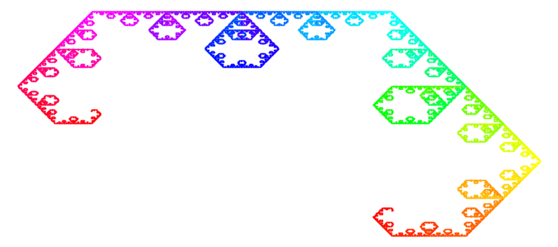
And this is the same thing with 1 as "move forward" and anything else meaning "turn left 30 degrees":

Another stretched-hexagon fractal, with a swirly circular structure on the smallest scales
These ternary ones look a little like the Lévy C fractal, only different.

They're differently oriented but you can see they have the same vertically-stretched appearance. That's real: I left in the numbered axes so you can see the picture hasn't just been displayed at the wrong aspect ratio. That's weird, to me--there's nothing about my drawing rules that singles out a special direction in the plane (aside from the initial condition). It must be something about the long-range internal correlations in the sequence itself.

Much as with the binary Thue-Morse sequence, you can get a fractal of this appearance in a lot of ways out of this sequence.

You'll notice, though, that I'm dropping some information here: for both of these curves, I'm paying attention to whether a digit is a 1 or not, but not to the difference between 0 and 2. If, instead, the digit 2 is singled out, I get this (here 2 means "move forward" and anything else is "turn left 90 degrees":

Another stretched-hexagon fractal, only this time the stretching is horizontal.
Weird, now the stretching is horizontal. (Also I ran it on much more of the sequence so you can see more of the fractal structure.) But it's not magically fated to look like this no matter what--if I assign different actions to all three digits, then I can get out some completely different-looking fractals, like this one-- this is "1=move forward, 2=turn left 45 degrees, 0=turn left 90 degrees":

A completely different-looking fractal with sort of a curved, lacy appearance.
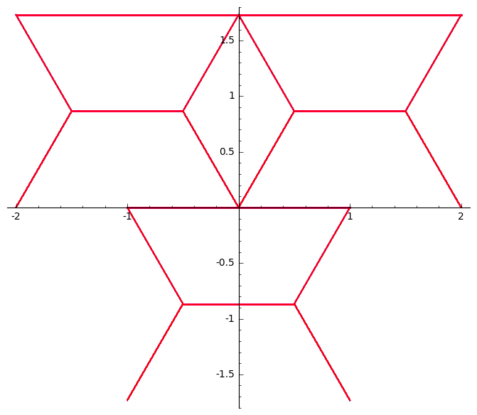
And sometimes the symmetries in the sequence cause any fractal structure to collapse out altogether--if you use the "move forward/turn left 60 degrees" rule on this one, for instance, you don't get a fractal, it just traces over and over this shape that reminds me of an Autobot face:

A simple geometric figure that looks a little like a Transformers logo.

The higher n-ary Thue-Morse sequences similarly converge on these sort of squashed cauliflowery looking shapes. Singling out one digit as special seems to produce more and more squashing/stretching the higher you go. Here's a base-5 one:

A shape that looks a lot like a severely flattened cauliflower.
mmcirvin: (Default)
 In part 1 of this series of indeterminate length, I mentioned the Thue-Morse sequence, a certain sequence of zeros and ones, and the counterparts of it for more than two symbols. When I was messing around with Thue-Morse I came across a webpage by Zachary Abel that mentioned something remarkable about them: interpreting them as a turtle-graphics program gives you a thing that somehow converges to the Koch snowflake curve, the archetypical simple fractal. (Abel defines the Thue-Morse sequence as the complement of the way most other people define it, starting with 1 instead of 0, but for this purpose it hardly matters.) This paper by Jun Ma and Judy Holdener proves in some detail that this does in fact converge to the Koch snowflake:
Koch snowflake made of small-scale squiggles with turtle graphics, rainbow colored
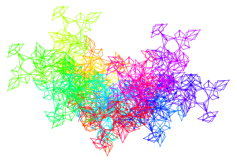
This isn't the textbook way that you usually draw the Koch snowflake with turtle graphics; it's simpler. You don't even need a "right turn" rule. You don't need recursion (except inasmuch as recursion is built into the Thue-Morse sequence, which you could argue it is). You just have the turtle follow the sequence, and turn left 60 degrees when it has a 0, and move forward one unit if it has a 1. The turtle at first seems to be crawling around in drunken squiggles, but if you just let it go, the overall shape of those squiggles turns out to be the Koch snowflake.

And, actually, that's not even the only way to do it. It also works if you interpret the bits the other way around. Or if you tell it to turn 120 degrees instead of 60--the fine details of the path are different but it still converges to the snowflake. Or if you give it a bunch of other ways of interpreting the Thue-Morse sequence as turtle instructions. Abel's page explores all sorts of different cases that work.

Not every interpretation works. If you just put in an arbitrary number for the turn angle, most of them seem to just give a mess. Sometimes, that mess starts to resolve into a directional path on a very large scale and it's possible that you still get the Koch snowflake again, but I haven't been patient enough to tell. Maybe you get something else entirely! Here's 70 degrees:
A messy-looking meandering curve, rainbow-colored.
On the other hand, some you wouldn't think work, do. 75 degrees is sort of a punk rock snowflake:

A Koch snowflake curve with a lot of little spikes on the small scale.

Sometimes symmetries get you. When I first tried this, it didn't work because I was using the same sequence interpretation I use for the Heighway dragon curve: move forward every time, and turn left if you have a 1 and right if you have a 0. That fails because of the symmetries of the Thue-Morse sequence: every four symbols, the turtle ends up moving in its original direction, and you just get a long line with aperiodic wobbles in it, not very interesting. That's true no matter what turn angle you try.
A horizontal line with that wobbles upward and downward with square bends, but just keeps going horizontally on the largest scales
But if you tweak the rule a little to break the symmetry, so that it turns, say, 120 degrees left for a 1 but only 60 degrees right for a 0... then you get the Koch snowflake again. Only the small-scale squiggles are different.
Another rainbow-colored Koch curve, with a slightly different small-scale structure
The Ma and Holdener paper proves that this is indeed the Koch curve for the first rule I mentioned, and for the complementary case where the symbols are interpreted the other way around, and they speculate that there are many other related sequences that have the same property. Kennard, Zaremsky and Holdener then found a whole family of these sequences.

But I don't think there's been a comprehensive study of what happens when you change the turtle interpretation of the series, as Abel did and as I'm doing here. I suspect that in many cases, changing the turtle rule is equivalent on a larger scale to modifying the series instead, in some way that keeps it consistent with Ma and Holdener's conditions.


But there's more...

mmcirvin: (Default)
This is part 1 of a series of indeterminate length. Part 2 is much better-looking and it's OK to skip ahead. Part 3 is here and contains some explorations I think may be new.

When Google+ went down, it took with it a bunch of my recreational-mathematics fumbling from the past several years. Fortunately I downloaded an archive of all that stuff, but it's not in the greatest format to browse. There are some things that deserve revisiting.

In 2017, Owen Maresh (who often gets me investigating things by making mathematical art or speculating about some intriguing pattern) mentioned something peculiar on Facebook: that the sequence of nested fractions that goes

1/2, (1/2)/(3/4), ((1/2)/(3/4))/((5/6)/(7/8)), ...

seems to converge to 1/sqrt(2).

Three-legged fractions

Not content to stop there, he started thinking about his own generalization of fractions (which I've never seen anywhere else, so I'll name them after him: "Maresh multifractions") that had more numbers in it than just a numerator and a denominator. He came up with a lovely notation in which the fraction bar was replaced with a three-legged shape, like a Y. I'll use a form that is easier to type:

M(a, b, c) = a * b^(e^(i*2*pi/3)) * c^(e^(i*4*pi/3))

This is easy to generalize to more numbers (I wish I had MathJax here):

M(a_0 ... a_(n-1)) = a_0 * a_1^(e^(i*2*pi/n)) * ... * a_(n-1)^(e^(i*(n-1)*2*pi/n)))

The idea is that you have n numbers, and they're raised to the power of complex numbers that are equally spaced around the unit circle, then multiplied together.

For n=2, these are regular fractions: the complex exponent that a_1 is raised to just reduces to e^(i*pi)= -1, so it's M(a, b) = a/b. For n>2 they are generally complex numbers. I don't think objects like these have been studied much, because if you plug in integers, they don't form a field or even a ring: they are not, in general, closed under addition for n>2. So they're not a simple generalization of the rationals.

Still, he wondered aloud about nesting them the same way, as in M(M(1,2,3),M(4,5,6),M(7,8,9)), and so on. What do you get in the limit if you nest those to infinity? I eventually did some numerical experiments and didn't find an obvious detailed pattern in the complex phases, but the absolute magnitudes of these numbers did seem to converge to 1/sqrt(3), and in general to 1/sqrt(n) for n-legged Maresh multifractions.

Jumping numbers

But, meanwhile, I played around with the simple fraction case and soon realized that in the nested fractions, once a fraction in the sequence up top was reduced to an ordinary fraction, the integers would jump between the numerator and the denominator in a strange aperiodic way. For instance, here's the fifth iteration:

31*30*28*25*24*21*19*18*16*13*11*10*7*6*4*1
------------------------------------------------------------------
32*29*27*26*23*22*20*17*15*14*12*9*8*5*3*2

Whether a given integer ended up in the numerator or the denominator depended on an aperiodic sequence that I eventually realized was the Thue-Morse sequence:

0, 1, 1, 0, 1, 0, 0, 1, 1, 0, 0, 1, 0, 1, 1, 0, 1, 0, 0, 1, 0, 1, 1, 0, 0, 1, 1, 0, 1, 0, 0, 1, ... 

This is oeis.org/A010060 and is much more famous than I'd initially realized. You can generate it by starting with 0, then at each stage adding the complement of the existing sequence onto the end (all zeros become ones and vice versa). Or, if you want to go inside out, you can generate the whole sequence by repeatedly replacing every 0 with 0, 1 and every 1 with 1, 0.

The j'th number in the sequence is also the sum of the binary digits of the number j, modulo 2. (In other words, it's zero if the number of 1s in the binary representation is even, and one if it is odd. The ubiquitous John H. Conway called these "evil numbers" and "odious numbers", so the Thue-Morse sequence says whether every nonnegative integer is evil or odious.) Very simple.

Once I'd figured out that the Thue-Morse sequence was relevant and had a name, Owen then looked at the MathWorld page for the Thue-Morse sequence and noted that it had the answer to his original question: the convergence he'd noticed by experiment is equation (2) there, a theorem conjectured by Woods in 1978 and proven by Robbins in 1979 (at the time I think they had the attribution wrong, but they've corrected it since).

This paper by Allouche and Shallit, www.cs.uwaterloo.ca/~shallit/Papers/ubiq.ps (PostScript file!) has a lovely short proof of the theorem that Woods described in 1987. The best thing I can do to summarize it is just quote my departed Google+ article:

What we're really trying to find is the infinite product
 
P = (1/2)^1 * (3/4)^(-1) * (5/6)^(-1) * (7/8)^(1) * ...
 
where the exponents are all -1 raised to the power of the Thue-Morse sequence numbers. Now consider the product Q, which is constructed almost the same way, only we start with 2, and also start with the second element of the Thue-Morse sequence:
 
Q = (2/3)^(-1) * (4/5)^(-1) * (6/7)^1 * (8/9)^(-1) *...
 
Now multiply them together. The odd numbers cancel out, except for 1:
 
PQ = (1/2)^1 * (2/4)^(-1) * (4/6)^(-1) * (6/8)^1 * ...
 
We can simplify those factors to make
 
PQ = (1/2) * (1/2)^(-1) * (2/3)^(-1) * (3/4)^1 * (4/5)^(-1) * (5/6)^1 * (6/7)^1 * ...
 
Now, the Thue-Morse sequence has a kind of self-similarity: if you pick out the even-numbered elements (with zero-based numbering), they're the same as the original sequence, and the odd-numbered elements are the complement of the original sequence (0 swapped with 1). (That follows immediately from its definition in terms of a symbol-rewriting system). So if we separate out the even-numbered and the odd-numbered factors in this infinite product, we get
 
PQ = (1/2) * (1/P) * Q
Q drops out entirely, and
P^2 = 1/2
P = sqrt(2)/2.
 
Q, which I'd approximately calculated (or was it just a related number?) while I was messing around with this stuff earlier (it fell out of my sort of "generating function" method), is quite mysterious; this paper says it first appeared in a paper by Flagolet and Martin (the Inverse Symbolic Calculator mentioned Flagolet), and claims nobody has proven whether it is even rational or irrational.
 
n-ary Thue-Morse

Though I still haven't worked it out in detail, I strongly suspect that that proof can be generalized to Maresh multifractions to obtain the result about the absolute magnitude of the nesting limit that I found by experiment, 1/sqrt(n). Only, in that case, the relevant sequence would not be the binary Thue-Morse sequence, it would be a generalization to base n. For instance, for the three-legged fractions Owen was wondering about directly, it'd be oeis.org/A053838 , which we might as well call the ternary Thue-Morse sequence:

0, 1, 2, 1, 2, 0, 2, 0, 1, 1, 2, 0, 2, 0, 1, 0, 1, 2, 2, 0, 1, 0, 1, 2, 1, 2, 0, 1, 2, 0, 2, 0, ...

Here, at each stage of the expansion you'd concatenate the sequence with two versions of itself, with the symbols incremented by one or two steps modulo 3. Or, alternatively, just replace every 0 with 0, 1, 2, every 1 with 1, 2, 0, and every 2 with 2, 0, 1. Or, it's the base-3 digit sums of the nonnegative integers modulo 3. And there's an analogous sequence for any n, many of which are linked from the OEIS page for the ternary version.

Why am I talking about this now? Why are fractals mentioned in the title of this post? See why in part 2!

mmcirvin: (Default)

Koch snowflake curve in white on black, drawn with 1980s Atari BASIC
This is only the tribute.

I was fascinated by turtle graphics, as embodied in the computer language LOGO, which was intended for kids. This is a system where your drawing cursor, the "turtle", has a position and a movement direction associated with it, and takes relative angular rotation and forward movement instructions. It's good for drawing things like simple fractals and certain mathematical curves.

The first thing I implemented, I recall, was an interactive turtle graphics system where the user chose commands directly from a menu by number. But that was pretty limited for anything other than simple geometric doodling. What I really wanted was a turtle-graphics library I could call from BASIC. Well, in a language that doesn't even really have functions that is a kind of awkward thing to manage, but I did figure out that I could have a kind of named GOSUB by assigning a line number to a variable, so that was nice. I just had to put all my "arguments" in special global variables and then call GOSUB TURN or GOSUB DRAW, etc. Then I had a sort of BASIC program skeleton I could save on a floppy, load whenever I wanted and put my little application at the beginning. It was sort of a mess, but it worked. It's long-gone, but today I reconstructed something like it in a couple of hours.

mmcirvin: (Default)
This 2017 video from The 8-Bit Guy took me back:


The people in the video mention typing in the type-in programs in computer magazines as a formative experience for kids of our generation and a sneaky way we learned programming. I confess, I got Compute! magazine but I almost never had the patience to type those in. I think I only ever entered one or two of the big ones. (Often they were largely in machine language and involved typing in many dozens of lines of meaningless DATA statements, containing the machine instructions to be loaded into memory. I remember that eventually they came up with a standard loader program that took checksums along with the data, to make it easier to get everything in correctly.)

I was more interested in writing my own programs for my Atari 8-bit machine, but I wasn't sufficiently willing to delve into the technical details of the platform to become a 6502 machine-language virtuoso. Instead... I found myself waiting excitedly for Scientific American magazine.

See, in the back of Scientific American in those days was a column that originally belonged to Martin Gardner, the mathematics popularizer and skeptic-movement founder, and was called "Mathematical Games". Gardner's column was great but he only infrequently did anything directly computer-related; but he retired in the early 1980s (I think his last column was a searing denunciation of Arthur Laffer's economics) and handed it over to AI researcher Douglas Hofstadter, who renamed it with the anagram "Metamagical Themas".

Hofstadter basically just wrote about anything that crossed his mind, from 19th-century nonsense literature to Cold War politics. This was consistent with his most famous work, Gödel, Escher Bach: An Eternal Golden Braid, one of the weirdest hit popular-science books of all time: it was a rambling, phone-book-sized meditation on mathematical logic, artificial intelligence, psychology, computability theory, molecular genetics, particle physics, Baroque music and the art of Escher and Magritte, drawing sometimes illuminating and sometimes highly tenuous connections between all of them, with a structure alternating nonfiction chapters with goofy fantasy dialogues inspired by Lewis Carroll that explored the same topics metaphorically.

It was a huge influence on my developing brain, and so was Hofstadter's column. And that sometimes described experiments one could do with computers--experiments that I could attempt to replicate myself, in a small way.

After Hofstadter, A. K. Dewdney took over. Dewdney was a Canadian CS professor who'd previously been featured there for some of his own work, including his explorations into how a civilization might live in a two-dimensional universe (which he worked into a book called The Planiverse). Dewdney turned it into a straight-up messing-around-on-computers column called "Computer Recreations". So now it was stuff I could attempt to play around with basically every month.

In fact, I don't remember very well which ideas came from Hofstadter and which from Dewdney. But I wish I still had some of the stuff I wrote back then. Probably my two most ambitious creations directly inspired by those columns were a simple text bot that produced rambling nonsense sentences based on a messy recursive grammar of GOSUB statements, and an Atari BASIC turtle-graphics library that I could use to draw fractals and the like. And they undoubtedly had an influence on my school science-fair projects, which tended to lean heavily on computer programming: one of them was a little simulated ecology with critters whose behavior was controlled by genes that could mutate, and who were subject to natural selection.


(Dewdney later got into some weird 9/11 conspiracy-theory stuff, but there had been no hint of it at this point.)
mmcirvin: (Default)
So, having reawakened my long-dormant memories of how to make a usable Atari disk image for saving files, I spent some time actually messing with Pinball Construction Set, Bill Budge's 1983 game that introduced most of the world to the concept of a game editor. Is it possible to make a decent pinball with this thing, one that will be fun to play in 2019?

Amazingly, it is! The game's limitations become immediately apparent when you mess with it, and there are a few things I wish you could do that you can't, but I think the program's limits were actually a big part of what made it enjoyable for the general public. You can whip together a table that can do most of what Pinball Construction Set could manage in a couple of hours, and the rest is just subtly tweaking and decorating it. There are modern PC pinball editors designed to let you put together accurate simulations of complex modern tables, but to use them well you need to master half a dozen technical disciplines. There's not much of that here. It sticks close to the goal of being a fun toy. Everything in the game editor works through a simple joystick-and-fire-button GUI, maybe the first time many people ever encountered something like that. The beautifully written manual (a time capsule from the absolute high point of software marketing and packaging) is 12 pages of text and three cheat sheets, and it covers everything comprehensively, even giving design hints and subtly acknowledging some of the game's anomalies and quirks.


There's some graphical crud here that is probably from bugs in the application, which I haven't bothered to clean up. Also made no effort at all to decorate the table or the "backglass", which you can do; these are just the visual elements the game gives you. (Adding artwork to your pinball is one of the more cumbersome and unpleasant elements of the editor, unfortunately, and I didn't mess with it much. Editing the polygonal table geometry can also be a bit frustrating in this pre-mouse era.)

The first thing I did was to save a file with just my rendition of an "Italian bottom", that is, the more or less standard arrangement of slingshots, flippers and wire guides down at the bottom of the table. I figured I'd be going back to some variant of that a lot.

What I was going for here in general was nothing particularly original, but a homage to Ed Krynski's 1970s Gottlieb drop-target-fests like Big Shot or El Dorado. It seems like the first tables people make with PCS often clutter up the middle with a lot of bumpers and stuff, but I went for an open layout where the main goal is supposed to be bashing away at that bank of eight drop targets on the right (actually two adjacent banks of four). The tightly grouped pop bumpers in the upper left actually have a lovely Pat Lawloresque straight-through-the-bumpers shot off the right flipper, that also nails the spinner below them. That was an accident, and I ought to put some target in the path to make it worth more, because it's great. I put in a little diagonal barrier to keep the ball bouncing around in the pop bumper area once it gets in there, and then I put a couple of stand-up targets on the bottom to make it more than just a passive barrier, and because designers like Lawlor do that a lot.

The gizmo behind the small third flipper is a simple multiball lock. You can't do anything fancy like require some action to activate the lock; it's always active, it holds three balls and when it's full it dumps them all out for multiball. Simple to understand.

Lots of reviews of PCS complain about the weird and unbalanced scoring options: for some reason, the game emphasizes gigantic end-of-ball bonuses that dwarf the amount of points you can directly award for a target. Maybe the reason the bonuses get so big is that they are also the only really nontrivial table rules you can establish. There's a single type of logical element, an AND gate, and all it can do is AND up to three items together to do one of two things: add points to the bonus, or bump up the bonus multiplier. I did the common thing of making completion of those three rollover lanes at the top increase the bonus multiplier, and I have a bonus for getting the two standup targets (maybe too cheap a victory, I don't know), a bonus for getting multiball, and a relatively big bonus for completing all eight drop targets on the right. That last goal is very hard, and maybe it should be worth even more, but I didn't want to make it too much of a Golden Snitch. You can't award specials or extra balls or anything like that, as far as I can tell, or I'd definitely put one there.

But for purposes of a program like this, I'm not sure you really want much more complex table rules. I mean, I get it, I once had great fun wiring up a baroque state machine in Disney Infinity to play the old Merlin Magic Square game (with added killer robots) just to see if I could, but keeping it very simple probably feeds the player's sense of accomplishment and avoids getting people into really frustrating situations where they break their table by wiring up unexpected behavior they can't figure out.

What did I miss? The main thing, overwhelmingly, is that I wanted more control over the geometry of the flippers. You have big and small left flippers, big and small right flippers, and all of them have a resting state where they're canted at a weirdly steep angle, much steeper than a typical bottom flipper but not as steep as a sideways flipper. This makes it really hard to aim a shot with a trapped ball (though I appreciate that you can trap balls) or a ball coming down the inlane: the ball slides down the steep flipper in an instant, much faster than on a typical real pinball. It makes my target-shooter table design particularly challenging. I'd like to either have some control over the angle of the flipper, or at least have a better default.

Still, this pinball I made using this ancient toy editor from the dawn of personal computing isn't the greatest, but it is actually fun to play! I got it to the point where I wanted to play it more than tinker with it some more. You do get just a little taste of the pinball design process, where the designers make a plain prototype of the physical design called a "whitewood" and then spend some time "flipping the whitewood", that is, playing the naked table so that they can tell what works and what doesn't, and what shots are fun to make so that it's fun to reward the player for making them.

mmcirvin: (Default)
Night Mission Pinball, a 1982 release from subLogic, as played by ILLSeaBass:


Once again, I'm showing an Apple II video because I can't find one of the Atari version that shows the artifact colors correctly. The Atari version basically looks like this, just with slightly fewer colors. Like seemingly all of these pinballs, this one was yet another GRAPHICS 8 game with composite artifacting, probably because it was yet another port from the Apple II, and this was the most direct way to port Apple hires games.

This was written by Bruce Artwick, the author of Flight Simulator. As such, it's not so surprising that it has an aviation theme (World War II bombers) and really, really good physics. Seriously, for sheer feel this one blows away all of the other early 1980s computer pinballs: I could tell that after playing it for just a couple of minutes. The sounds are a bit annoying, though. (I didn't initially notice because with the Atari computer emulator I use on my Mac, I seem to have a choice between a version with broken sound and a version with malfunctioning keyboard interactions, and for most programs I choose the first.) It's another one that uses a two-joystick scheme with the fire buttons operating the flippers.

I think the layout of this one is original. I'm not a fan of the seemingly haphazard arrangement of pop bumpers in the upper middle, which remove opportunities for ball control and introduce a powerful chance element into the game, but otherwise it's pretty good. Reminds me just a little of the early Stern table Flight 2000, though it's not the same.

There is apparently a backbox/physics-tweaking mode that allows adjustment of a huge number of parameters, much like the parameter editor in Flight Simulator. I haven't played with that yet.


mmcirvin: (Default)
So, as the previous post mentioned, I was messing around a little with a few early personal-computer pinball games, specifically the Atari 400/800/etc. ports. How are they?

I think I'm a little spoiled for these tables, actually, because they're based on real pinball machines that I'm already overly familiar with, both in real life and in later simulations. The first big hit in computer pinball was Bill Budge's 1981 Raster Blaster, originally a program for the Apple II, ported before too long to everywhere else. Here's Mackinstyle's video of the Apple II version:


The Atari version looks pretty similar, except that there are purple As in place of the Apple logos on the bumpers, and the artifacting colors aren't quite as elaborate (I couldn't find a video that showed them properly). Anyway, a pinball fan will immediately recognize this table as an unlicensed imitation of Firepower, a pioneering 1980 table designed by Steve Ritchie.

(If you're primarily a video game fan, you probably know Ritchie better as a voice actor: "FINISH HIM!!!" His impressive voice is also often heard coming from his pinballs.)

It wasn't, by a long shot, the first multiball pinball, but it was the first multiball of the solid-state era, and the moment when it took, so to speak: after Firepower, almost every pinball had a multiball mode. It was also the first one where the user could rotate the lit rollover lanes by pressing the flipper button. It's a fast, simple, kind of brutal layout. The only real long-term table goal is multiball. You've got to hit those six little standup targets in the center repeatedly to light the locks for multiball, and every time you do, you risk draining the ball right down the middle. I find it addictive. I first encountered it in Farsight Software's Pinball Hall of Fame: The Williams Collection, played it more in their later sim The Pinball Arcade, and eventually got to play it for real at the late lamented Pinball Wizard Arcade.

How does Raster Blaster stack up to the original? It looks almost drab by comparison, for one thing: the real pinball is covered with all this glorious fake-Jack-Kirby-meets-fake-Star-Wars art. Budge couldn't do anything like that with the simple graphics at his disposal. He did get in a clever parody of the Bally logo, though.

The feel is OK but not great. It feels to me like the ball is very light and floaty (a common problem with early simulated pinballs) but the flippers are weak to compensate. Sort of the opposite of Zen Pinball FX's excesses. But if you'd never played pinball on a computer before, or only encountered something like Atari's 2600 Video Pinball cartridge, this would have been amazing--it's aping a real machine and one that had made a big splash just one year before.

My previous post showcased David's Midnight Magic by David Snider, which came out not long after. You'll notice a similarity of presentation, down to the big script-lettering version of the author's name (no longer parodying the Bally logo, I suppose). But whereas Raster Blaster imitated Firepower, David's Midnight Magic imitated... Steve Ritchie's other great 1980 pinball machine Black Knight. This was one of the first machines to have a multi-level playfield, and I think it also introduced Magna-Save. It's another one that I was introduced to through Farsight's sims (unfortunately Farsight lost the Williams license so you can't buy these in The Pinball Arcade any more!) and also eventually played in real life. I'm not quite as fond of it as Firepower (I prefer the sequel Black Knight 2000), but it's if anything more famous than Firepower. Long before I played any version of it, I remember reading about it in a Science 80 article covering the development of a new pinball (Black Knight) and a new videogame (which was Star Castle).

Again, the technical impossibility of even approaching the great artwork of Black Knight is unfortunate, but we can chalk that up to the times. I think the feel of the table has similar problems to Raster Blaster: the ball feels too floaty (almost like the light plastic Powerball in Twilight Zone) but the flippers too weak. But, again, this would have been amazing in 1982. When Atari tried to make a port for the 2600, they were probably stymied by the platform's technical limitations and ended up with a completely different, unrelated pinball, marketed as just Midnight Magic--which I personally find far more addictive than David's Midnight Magic, for some reason, though it doesn't have multiball or a two-part playfield.

Bill Budge, for his part, went on to make the epochal Pinball Construction Set for the nascent Electronic Arts (back when they were the cool, artsy, envelope-pushing video game company), one of the first games to offer the general public an editor that they could use to make their very own custom games! I didn't have this program back in the day and I've only scratched the surface of it--my impression from messing with it just a little is that its user interface is kind of touchy and unforgiving by modern standards, but a lot of time has passed since the early 1980s. One of the things it could do was allow you to save your pinball as a standalone executable, and apparently these user-created pinballs (most of them undoubtedly very bad) absolutely infested the BBS scene in those days.

mmcirvin: (Default)
So I've been taking another trip down memory lane, actually messing with some stuff I never had as a kid: pinball simulations on the Atari 400/800/XL/XE computers. The most famous pinball games on early personal computers tended to be pretty straight ports of games from the Apple II, and when you see videos of them in emulation or played on modern video hardware, often they look incredibly ugly--monochrome graphics with eye-hurting vertical stripes, like in this video from ILLSeaBass of David's Midnight Magic:


You may recall this kind of thing showing up a lot on CGA MS-DOS games too.

But then again, the graphics might instead look like this (posted by ILLSeaBass as well):


Much better--now there's colors, if somewhat peculiar colors. It's the same game. What's going on?

These Atari releases were in a graphics mode that Atari BASIC programmers called "GRAPHICS 8", the highest-resolution mode, which for a full screen gave you 320x192 pixels. But it was a monochrome mode: you could specify the background color, and the brightness of the foreground color relative to that, and that was it.

How do you get colors in a high-res monochrome mode? Well, these home computers like the Atari were usually hooked up to a color TV, which, in North America in the 1970s and 80s, used the NTSC analog broadcast standard. On those TVs you could use a trick called "artifacting": if you made a pattern of alternating vertical white and black stripes, it would appear as a solid field of color. You didn't have a lot of control over the colors; you could get a couple of different ones depending on whether you put the white lines on the odd or even pixel values. And on Ataris, the colors also varied wildly between different releases of their graphics chipset, so that was a thing you had to live with. But it was a thing you could do. Apple II and TRS-80 CoCo games did this a lot too.

With MS-DOS games, though, it was actually pretty common for a PC to be hooked up to something other than a TV or composite color monitor, and then games that used this effect would look like butt. Often you could turn it on or off on those games to account for the kind of monitor you were using.

When I was a kid messing around with Atari programming, I knew about this and played with the effect, but I didn't know how it worked. I thought vaguely that it had something to do with the positioning of the colored phosphor dots on the screen, but it has nothing at all to do with that. It's actually all about the way the NTSC standard encodes color information. Color is encoded in an extra modulation layered right on top of the monochrome brightness data. There's a signal with a period that happens to correspond exactly to two horizontal pixels of this GRAPHICS 8 mode. The amplitude of the signal variation controls the saturation of the color, and the phase of it (relative to an invisible spike at the beginning of every scanline called the "colorburst") controls the hue.

This has a number of implications. An old-school analog television doesn't have pixels, unless it's hooked up to something that generates pixels, but it's never going to be able to show any involved detail with a horizontal frequency that's very high without it turning into colorful hash. Seventies guys wearing houndstooth jackets would show up on TV with the pattern turning into psychedelic rainbow colors. Home computers that were hooked up to TV sets were limited practically to 40-column text, because the horizontal detail needed for narrower characters would turn into artifact mush; that meant they were less useful than they could be for serious productivity applications. But it also meant that with a 320-pixel-wide monochrome graphics mode, you could tickle the TV's color-decoding circuitry directly just by alternating dark and light pixels. 

The effect didn't work on PAL TVs because they had a different color clock frequency that didn't coincide precisely to two pixels, and I think they also had some error-correction capability that specifically prevented this sort of thing. There, you'd apparently get shades of gray from something like this.

You could only really get a couple of extra colors this way, and, as I mentioned, the colors on Atari 8-bits kept changing when Atari changed their graphics hardware slightly. The GTIA chip produced different artifacting colors relative to the earlier CTIA, and the XL/XE computers changed it again. Why? Well, they slightly changed the timing of the signal representing video pixels relative to the colorburst, so the same pattern of pixels would give you a different relative phase and therefore a different hue. Some Atari computer emulators actually simulate the artifacting produced by all these iterations of the hardware, and give you the option to choose.

mmcirvin: (Default)
Every port of Atari's 1979 arcade game Lunar Lander seems to map the controls differently, and it's an interesting exercise in translation.

Lunar Trails Art Project: http://moonlander.seb.ly/
IGN: https://my.ign.com/atari/lunar-lander
It's also on Atari Flashback Classics, volume 1.
(The Atari 2600 Space War Star Ship cartridge also had a mode called Lunar Lander, but it's a completely different game, not much of a game really; it actually predates the arcade game.)

It's interesting to think that Lunar Lander was developed concurrently with Asteroids (many of which ended up shipping in surplus Lunar Lander cabinets, because Asteroids was way more popular). It feels like a throwback to the pre-Space Invaders era of the early 70s, when a coin-op arcade game could be something other than frenetic action. It's just a quiet, tense battle between you and physics, and physics is definitely trying hard to kill you. The inspiration was old text-based mainframe "Lunar Lander" simulations that were, obviously, themselves inspired by current events. You're trying to land on the Moon, and you've got to fire your rocket in such a way that you don't either come down too hard or run out of fuel and end up as a smear on the landscape. Usually they would only simulate vertical motion.

Atari's was two-dimensional, for an added degree of challenge--it was a hard game, though still nothing compared to what real Apollo astronauts had to deal with. Your LM started out traveling horizontally over a craggy landscape with just a few good, flat places to land, some of them labeled with score multipliers; you'd be gradually accelerated downward by gravity, and there was also a tiny, fictitious friction force operating as a bit of mercy toward the player (at least in the easiest difficulty mode). Instead of some number of lives, you had a finite fuel reserve. When you either crashed or landed successfully, you'd get a text message and some number of points based on your performance; either way, if you had any unburned fuel, the scenario would just start over with the remaining fuel and a new landscape. When you hit the ground with no fuel, the game was over.

The controls were somewhat eccentric:
www.arcade-museum.com/images/118/118124212764.jpg
There were left and right rotate buttons like Asteroids, but instead of a button, the rocket-engine throttle control was this gigantic analog lever that offered variable engine thrust. I think it was bigger than the one in the real Apollo Lunar Module. And then there was an "abort" button that you could push if you were in deep trouble, that would immediately right the LM's orientation and push out a huge rocket blast to send you up into the sky (also spending a lot of fuel).

So how do you map these to a keyboard, or a game controller? The Lunar Trails project, which I think is a new reimplementation (albeit one that looks a lot like the original), just maps rotate left, rotate right and thrust to the left/right/up cursor keys, and I think it leaves off the abort button entirely (or at least I can't find it). It's actually possible to land nevertheless. I don't think it simulates the different difficulty levels.

The IGN implementation, which I think is an actual emulation, maps rotate just like the Lunar Trails version, but up and down now increase and decrease the rocket thrust, to give you fine control. The space bar is the abort.

What drove me to write this is that I initially thought the Atari Flashback Classics version was broken: I couldn't figure out how to control the lander. Turns out they mapped left, right and up on the D-pad or joystick, which would be left/right/thrust in an Asteroids-type game, to rotate left, rotate right and abort. (Update: I'd misremembered; it's the A button that is mapped to abort.) The throttle is the right trigger, which makes some sense because on the XBox One controller this is a one-dimensional analog control. You can vary the thrust by squeezing the trigger to varying degrees. It's probably not as fine control as that big old handle, though.

Eventually Atari elaborated the basic concept into Gravitar, which is the same basic idea of "spaceship in ruthless gravity field" only even harder and you're also fighting enemies. I suppose you could call it Lunar Lander crossed with Spacewar. Gravitar reverted the engine control to a simple thrust button.

https://my.ign.com/atari/gravitar

It is astoundingly difficult. Gravitar was, I think, not that popular.

mmcirvin: (Default)
 So I gave in and got these packs for the XBox One. They're $20 each, which translates to about $6.50 in 1980 dollars. If you'd told me back in the early 80s that for six and a half bucks I could have a big box of 41 Atari VCS/2600 cartridges AND playable conversions of nine top-notch arcade cabinets (and another completely different collection for another six and a half bucks), I'd have fainted. Even if I knew perfectly well that most of the cartridges weren't really very good ones.

But time marches on. Are they worth $20 each? Eh... mayyybe, if you're nostalgic in the exact way I am. You can easily get playable versions of most or all of these on your computer for free by not strictly legal means, but it's nice having them all legitimately on the XBox. I admit that much of the attraction of Volume II for me was just having a console version of Major Havoc, a surprisingly complex and difficult early platformer/shooter using Atari's Quadrascan color vector hardware. (neb6's YouTube video of Major Havoc below got a comment insisting that somebody had to be lying about the game being from 1983; they couldn't possibly have done that with the primitive technology of the time. It reminded me of ancient-astronaut theorists.)

Some of these games are undone by the control scheme. Most of the paddle games like Pong and Breakout are just no good when played with a spring-centering XBox joystick. The Stella emulator actually does a lot better with these since it can use your computer's trackpad or mouse. Tempest... is actually playable, though it's definitely not as good as with the real rotary controller from the arcade machine. The arcade games made to be played with trackballs, like Missile Command and Atari Force: Liberator, work OK, but again they'd undoubtedly be better with the real thing.

On the other hand, the games with an Asteroids-style rotate-and-thrust scheme, like Asteroids, Asteroids Deluxe, Space Duel and Gravitar, fare surprisingly well. You can use the D-pad if you need fine control, and it actually feels better than the arcade buttons to me. Major Havoc comes across just fine. And Black Widow, another Atari color vector game that probably helped inspire Geometry Wars, plays great on this system: I think modern game controllers are better for twin-stick shooters than just about anything else. (Similarly, Robotron: 2084 is the absolute best conversion on the Midway Arcade Origins disc. Or maybe I just love twin-stick shooters.)

A nice bonus for the 2600 shovelware is that there are scans of all the original manuals included, and they've bothered to include on-screen captions of what the game variations mean. (The early cartridges particularly liked to advertise that they had dozens of different numbered game variations, which were usually the same game with every possible combination of three or four binary gameplay tweaks, in one- and two-player versions. It could make flipping through them a little confusing without reference materials.)

These are basically all the 2600 games they could get that were (a) made by Atari, and (b) lacking in any encumbering external IP license. That means a lot of the best games are missing: no Space Invaders (that was a conversion of a Taito game), no Defender or Stargate (Williams), no Pole Position (Namco), no movie licenses, etc. But I have a weird morbid fascination born of ancient Sears Christmas Wish Books with the crude, blocky 4K games they put out in the late seventies (correction: I'd misremembered; these very earliest games are actually 2K ROMs!!), and they're all here, including the "Miniature Golf" cartridge in which everything is a rectangle, which I have found inexplicably addictive since I was a kid.

They also have the 2600 versions of Missile Command, Asteroids, Centipede and Millipede, but they're somewhat overshadowed by the arcade versions, which are also here. Except that the arcade Missile Command kicks my butt, and I got really good at the 2600 version several decades ago and can still play it for a good long time.

mmcirvin: (Default)
I've been playing pinball sims again a lot lately, and I've noticed that recent software understandably leans toward emulating the complex and flashy tables of the 1990s and later (and fantasy elaborations of same). But sometimes I want something simple and quick, like an old electromechanical table. There are some modern emulations of those, but another way to dial it back is to play some of the earliest home pinball sims, the pinball games made for the Atari VCS/2600. I know of three, which I can illustrate with other people's YouTube videos...

Video Pinball, Atari, 1980

Atari made three completely distinct videogames called "Video Pinball", unrelated except for being pinball sims. The first was a slick and pretty fun coin-op arcade game that superimposed a 1-bit B/W video display on a physical, disco-themed playfield model that was reflected in a half-silvered mirror. The second was a visually primitive stand-alone home console in the late 1970s, and the third was an Atari 2600 cartridge. This is the only one of the games here that I actually played back in the heyday of the 2600, and I played it a lot. Here's espaciodejuegos playing it:


This game looks OK, if blocky, and it takes care to make use of the whole screen, but partly for that reason it's easily the least like real pinball of these cartridges. The playfield is kind of weird. The bottom is a vast horizontal expanse that the tiny ball can just bounce around to its heart's content; you spend a lot of time waiting, and with some skill a ball can last for a very long time. (The harder difficulty switch setting opens a couple of small extra drain holes in the bottom.) On the other hand, it's the only one of these games that actually allows nudging, with a fairly generous tilt setting, by holding the fire button down and moving the joystick.

There are 1- and 2-player games. Aside from the per-player difficulty switches that open the drain holes, the only other game variation controls whether accumulated bumper values are held between balls.


Midnight Magic, Atari, 1984/86

This was one of those games released after the 1983 videogame crash that few people saw in its cartridge heyday, though it's gained some notoriety since then as a remarkably good pinball sim considering the platform. It seems to have been intended as a port of the popular personal-computer game David's Midnight Magic, but that game had a layout shamelessly ripped off from the classic real pinball Black Knight, and this 2600 game definitely doesn't. As played by highretrogamelord:


It's symmetrical, probably because the 2600 hardware made symmetrical playfields much easier to produce. (They cheat graphically a little by not actually showing a full plunger lane.) It has some aesthetic similarities to David's Midnight Magic, though, and you can kind of see that they were trying to get some aspects of the Black Knight layout in there.

This game is really good, and much, much more pinball-like than Video Pinball, despite having no nudge. The playfield takes up much less of the screen, but it's the right shape and the bottom is like a real pinball machine, with inlanes and outlanes. With the default difficulty setting, the outlanes have always-active kickbacks in them and there's a pretty wide post in the center drain, which makes the game considerably easier; setting the difficulty to hard takes away the kickbacks and the center post, making it much more arcade-realistic. Like an old multi-player electromechanical, nothing about the table state is held between balls; that makes it a fairly challenging game in any event, and there's no shame in playing on the easier setting.

If I have a complaint about it, it's that the crucial drop targets at the top of the layout (which advance a multiplier if you get them all) are above the pop bumpers, so you can't really shoot for them from the bottom flippers, only from the side ones, which give you almost no ability to aim. It'd also be cool if, instead of the kickbacks being always on or off, you had to activate them by making some shot, like on many real pinballs. But trying to nail that spinner in the middle, or make the rollovers up in the corners, is a lot of fun.

Bumper Bash, Spectravideo, 1983

This one is really obscure, apparently very hard to find in actual cartridge form. I mostly remember Spectravideo for trying to introduce an MSX-based home computer in North America, but apparently they also made Atari cartridges. Theshadowsnose apparently has one, and has some entertaining commentary on it:


This isn't as pretty as Midnight Magic, but it might actually be my favorite of the three. If you play it in an emulator, you may have to mess with the control mappings a bit, because it was apparently intended to be used with an eccentric control scheme that reminds me a bit of what Farsight would do with Pinball Hall of Fame on the Wii decades later. It used the Atari 2600's paddle controllers, rotating dials usually used for ball-and-paddle games like Pong and Breakout. These had a red button on the side that was usually used to serve the ball, and they came in pairs that plugged into a single controller port with a Y-shaped connector. The idea was that you'd hold one of these in each hand and operate the flippers with the buttons, approximating the widely separated layout of the flipper buttons on a pinball machine. You could use one of the paddles to dial back the plunger.

This game has the most interesting layout of the three to me, because it's actually asymmetrical and has two sets of drop targets positioned where you can meaningfully shoot for them. Again, the bottom is pretty realistic. The lit rollovers at the top are held between balls, but the drop targets aren't. The ball physics is a little weird and janky compared to Midnight Magic, but I give the game major respect for its flipper physics: you can actually trap the ball and hold it on the flipper in this game, and I think it's the only 2600 pinball sim where that basic real-world pinball technique is really feasible. It makes the target shooting particularly fun.
 
Again, there's no nudge--the copy on the box tried to paint that as a feature by joking about it being "cheating". But the game has enough to interest pinball fans anyway.
 
Page generated May. 30th, 2025 06:35 am
Powered by Dreamwidth Studios